Sway. A new expression.
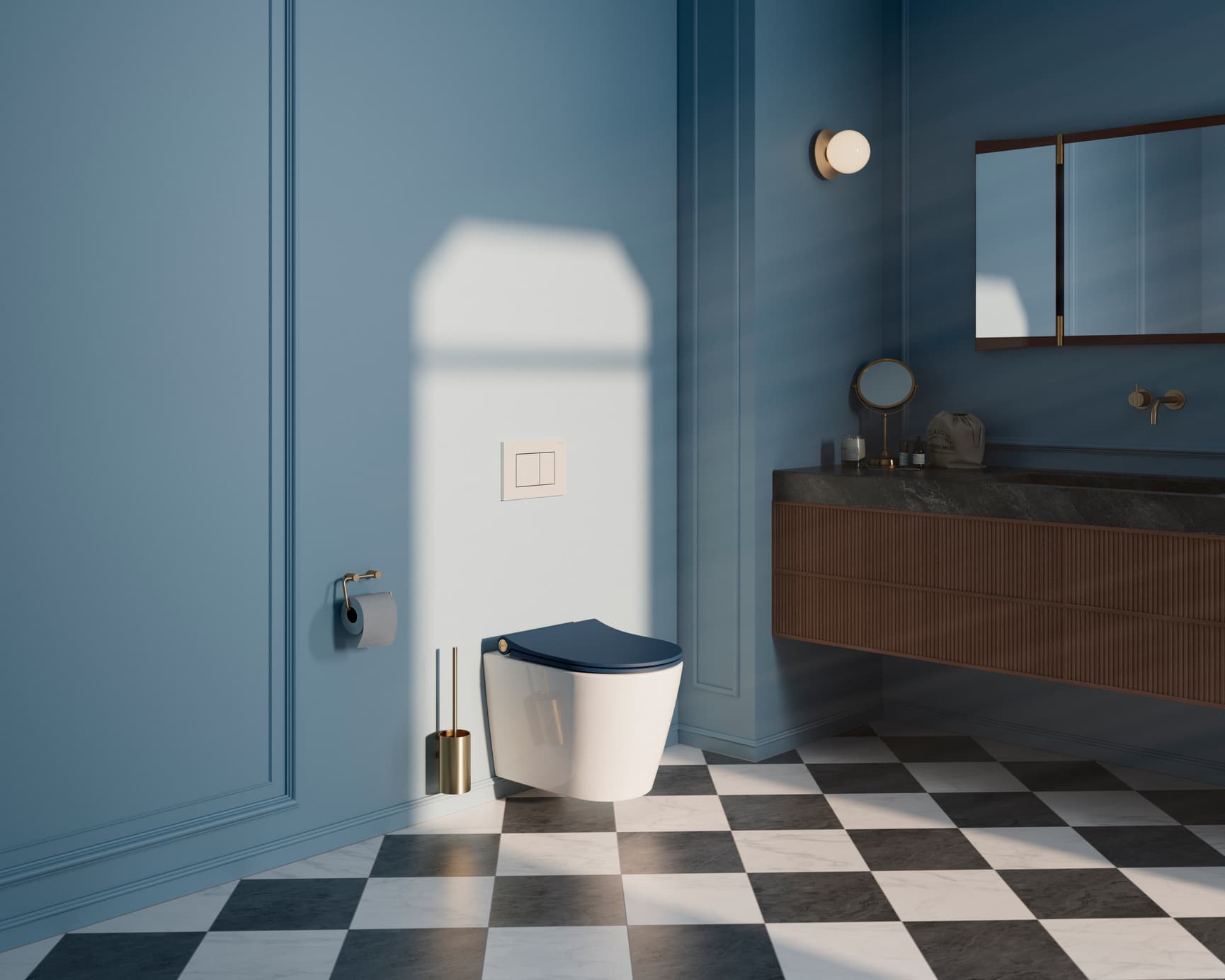
It's all in the details
Sway is defined by its slender profile, flowing curves and distinctive detailing. A considered balance of precision and softness, where form, function and comfort come together in one coherent design.
From the shape of the seat and lid to the characteristic cylinder and Pressalit signature, every element contributes to an expression that is unmistakably Sway.
A design created to endure and to evolve.
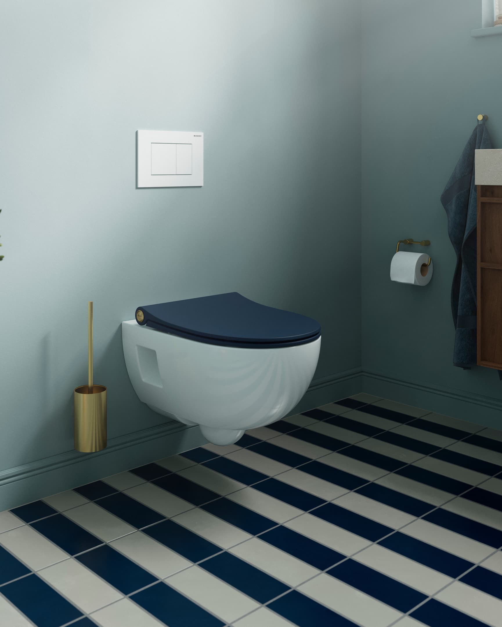
A new colour with a timeless character
Meet Matt Royal Blue
The ambition was to introduce a colour that could give Sway a new expression without tying the design to a passing trend. Matt Royal Blue is a deep, dark blue with a classic and refined character.
Inspired by the enduring appeal of navy blue, the colour draws on a world of heritage, tailored interiors and timeless materials. Paired with dark timber, natural stone and warm metal finishes, it creates an expression that feels established rather than trend-led.
On Sway, the depth of Mat Royal Blue brings definition to the slender profile, soft curves and precise detailing. The matt surface gives the colour a contemporary character, while retaining the understated elegance associated with classic navy.
"We wanted a colour that would give Sway a new expression without making it feel tied to a particular trend. Mat Royal Blue has that quality. It feels timeless and refined, with a depth that works beautifully with materials such as timber, stone and metal. It brings something new to Sway, while feeling completely natural to the design.”
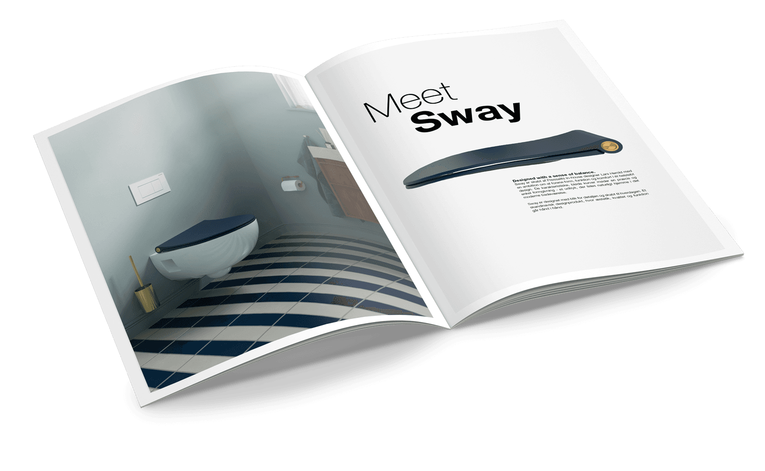
Explore the world of Sway
Discover Sway in a new expression. From the timeless character of Mat Royal Blue to the possibilities of interchangeable design emblems, our new brochure brings together the colours, details and design thinking behind Sway.
Find inspiration to make Sway your own here.
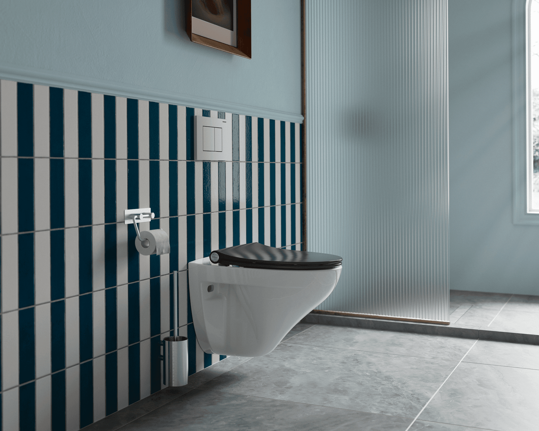
Make it your own
At the heart of the new Sway is the idea of personal expression.
One of Sway’s most distinctive details has always been the Pressalit emblem integrated into the cylinder. Originally designed as a permanent signature, it has now been carefully reworked to become interchangeable.
The idea is simple: to give you the freedom to adapt Sway to the bathroom around it – and to change its expression whenever you feel like something new.
Making such a small detail interchangeable required careful consideration. The cylinder was refined, the relationship between the emblem and the seat was revisited, and every millimetre was carefully considered, from the size and position of the logo to the way the emblem meets the seat.
The result gives one of Sway’s original design signatures a new purpose. The distinctive character remains, but the expression is yours to choose.
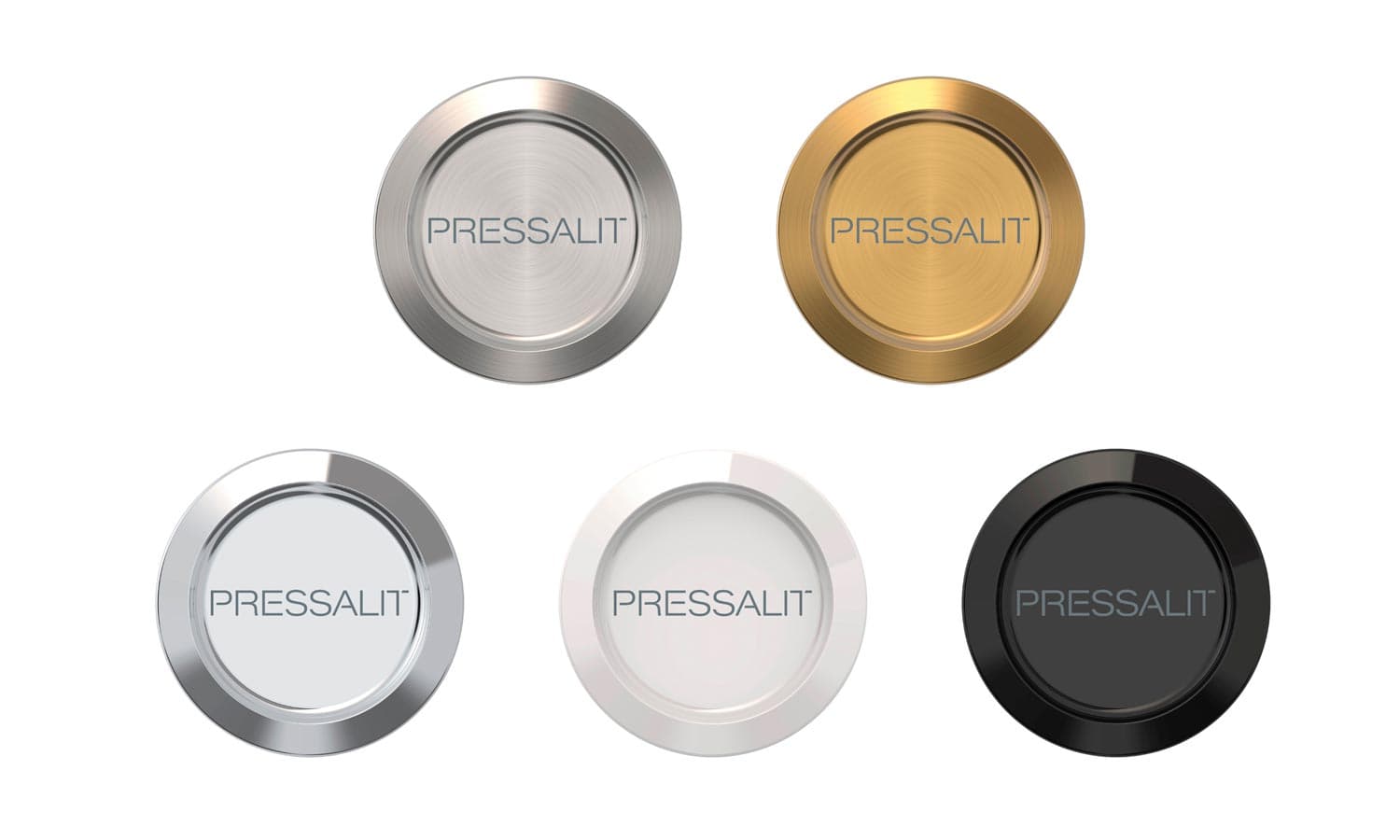
Five finishes. Five expressions.
Five different finishes have been carefully selected for the Sway emblem, each bringing its own character to the design.
Depending on the finish, the emblem can add warmth or contrast, create a more modern or classic expression, or become a subtle detail that blends naturally into the overall design.
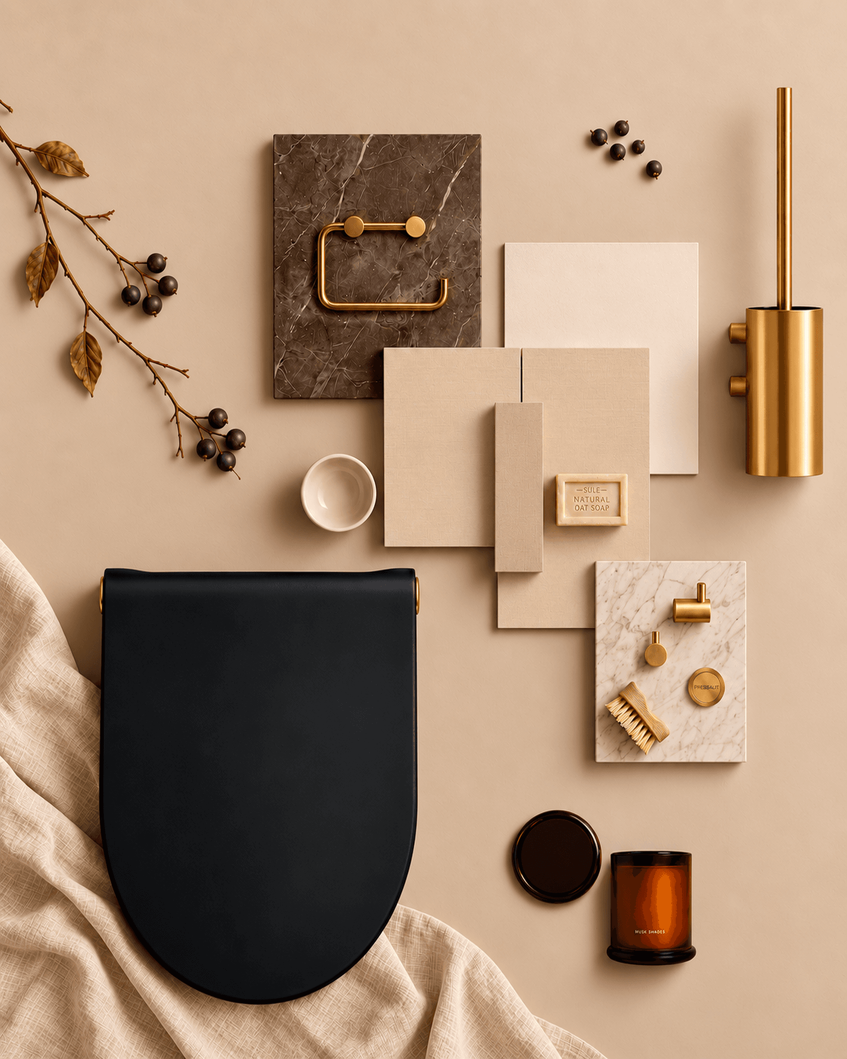
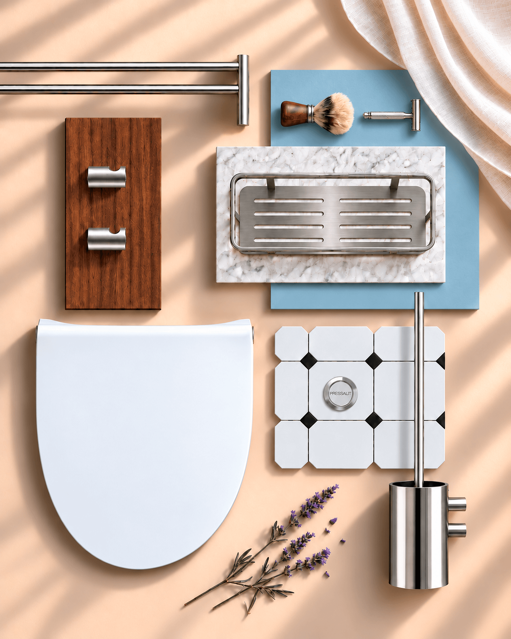
The finishes have also been selected to complement Pressalit Choice bathroom accessories, making it possible to create a considered connection between Sway and the other details in the bathroom – or to use the emblem as a deliberate contrast.
White · Black · Chrome · Brushed steel · Brushed brass
The choice is yours – and it does not have to be permanent. As the bathroom changes, the detail can change with it.
The story behind Sway
The original idea
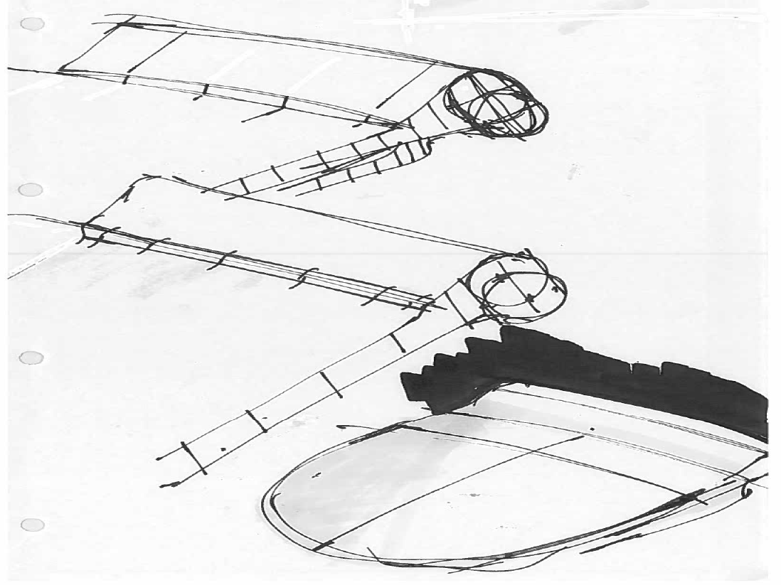
Sway has evolved, but the thinking behind the design remains. An original, refined for today. The story of sway began at the drawing board. The original ambition was to create something slim and delicately balanced. A toilet seat with a sense of visual lightness and a distinctly Scandinavian expression, yet with enough character to stand apart from strict geometric minimalism.
From the beginning, the design explored a careful balance between tension and harmony, precision and softness. Defined edges meet smooth, flowing curves. A slender profile meets a distinctive character.
Shaped by hand
The first forms were shaped by hand.
Sketches became handmade models, while computer-generated 3D studies allowed curves, proportions and surfaces to be explored with increasing precision.
Because designing something this simple is anything but simple.
Sway had to fit the ceramic, work with the human body and meet the realities of production – without losing the clarity of the original idea.
Comfort in every curve
From the beginning, comfort was an essential part of Sway’s form.
A toilet seat should not only be comfortable to use. It should look inviting and comfortable too. This thinking shaped the seat itself, where careful attention was given to creating a supportive and comfortable sitting position.
The same consideration extended to the lid. A closed toilet lid often becomes an additional place to sit in the bathroom, particularly where space is limited. Rather than giving Sway a pronounced upward curve, the lid was designed with a flatter profile and a subtle recess, creating a more comfortable surface to sit on when closed.
Considered as one
In Sway, comfort and aesthetics were never treated as separate considerations. The shape had to work visually and physically.
What appears simple is the result of countless small decisions.
Drawn by hand. Refined through precision.
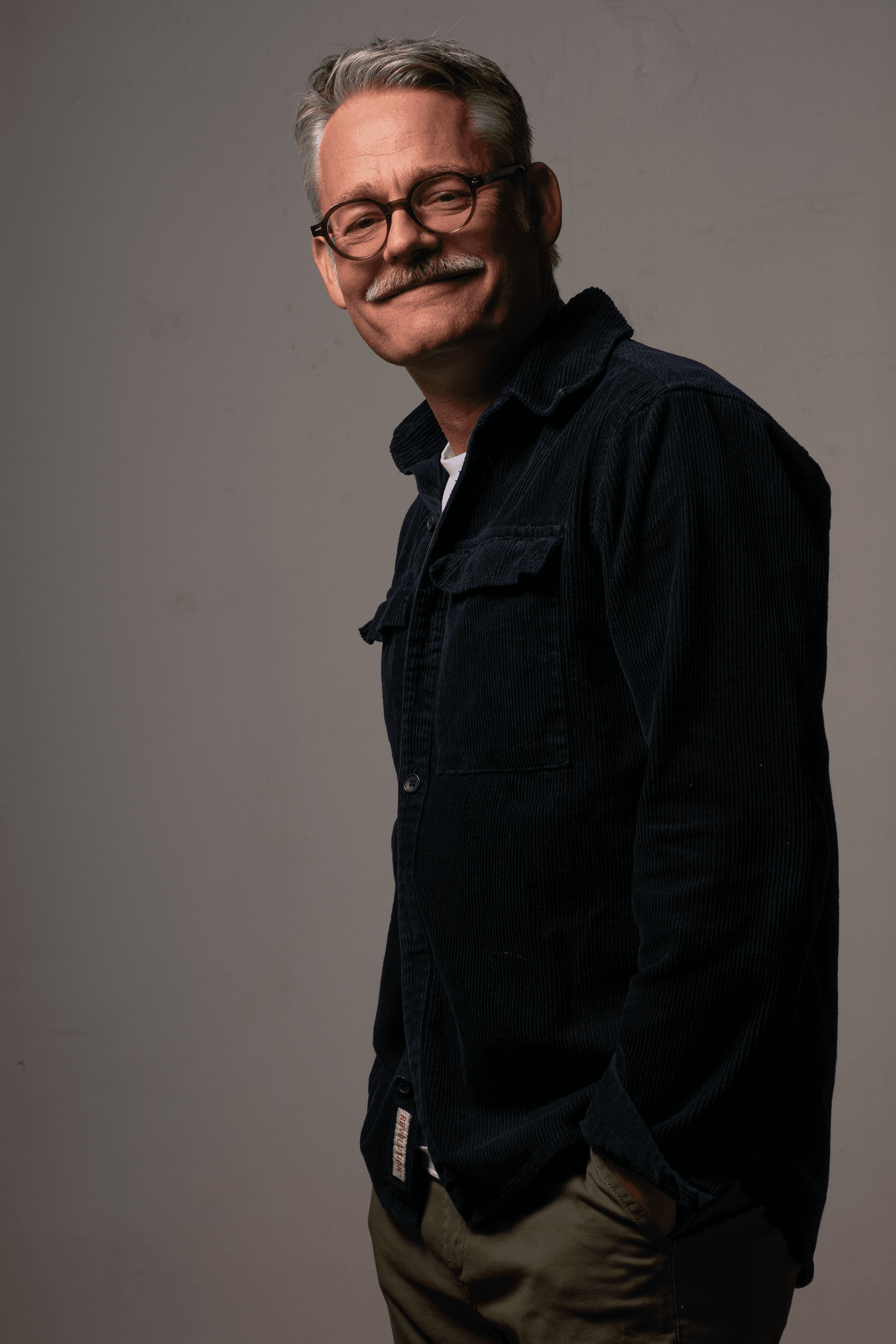
“A product like Sway has a long life. So the intention is not to change it simply for the sake of change. It is about looking at it again, refining the details and allowing the design to evolve while preserving what makes it Sway.”
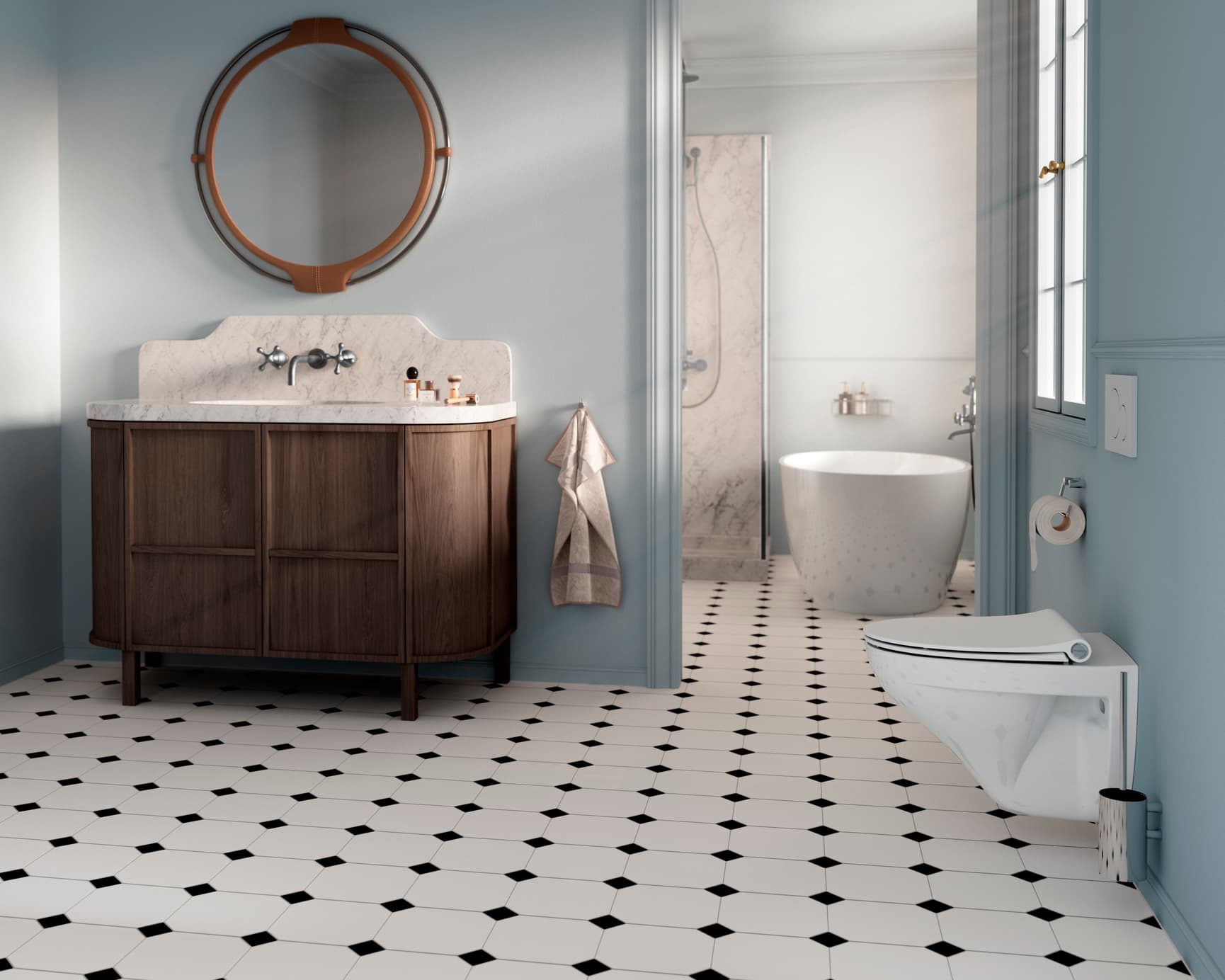
One design. Four fits.
Sway is one design, developed to fit different toilet ceramics.
Over time, the original design has been adapted into four models: D2, D300, Uni and Norden – each shaped to suit a different type of ceramic.
The fit may change, but the design remains consistent. The slender profile, flowing curves, distinctive cylinder and signature design emblems carry the same Sway character across the collection.
Behind each model is the same design thinking: adapting the proportions to the ceramic while preserving the expression of the original.
Four fits. One Sway.